
I was brought onto a multi-designer team to own two modules of Wizlo — a 0→1 EMR platform connecting clinics, doctors, and patients. My scope: the patient-facing portal and the clinical patient management module. This is an honest account of how that work happened.
Role
UI/UX
Category
Year

The brief, and what I actually did
Wizlo is an EMR platform built for clinics that want to manage their entire patient relationship digitally — scheduling, prescriptions, documents, vitals, clinical notes, and medication delivery — all inside one system. The platform connects three sides: clinics, their medical staff, and patients.
The project was large enough to need a team of designers, each owning specific modules. I owned the patient-facing side of the product and the clinical patient management module used by clinic staff. I was not the only designer on this project, and I want to be upfront about that. But within my modules, I owned the thinking end-to-end — from understanding the use case in discovery calls through to speccing components for developer handoff.
This was not a research-heavy engagement. It was delivery-focused with real client timelines. What I bring to this case study is not a 10-week discovery phase. It is how I made good decisions quickly inside constraints, and what that produced.
2
full modules owned as sole designer
ownership
15+
WZ feature tickets across 3 phases
scope
5
patient portal sections shipped
output
34%
drop in patient support calls
impact
The decision was made to build a proprietary CRM — one tailored exactly to the workflow, with a long-term plan to productise and upsell it once market-ready.

Two very different users. One platform to hold them both.
The first thing that became clear on this project was that patients and clinic staff use software in fundamentally different ways. Patients open the app anxiously. They want to know if their medication shipped, when their appointment is, what their results say. Clinic staff open the tool with intent. They need to find a specific patient, update a record, log a note, and move on. One side needs reassurance and clarity. The other needs speed and density.
Both were in my scope. That tension — designing for opposite usage modes inside the same product ecosystem — was the defining challenge of my work on Wizlo.
The insight that drove both modules:
patients need the right information surfaced without effort, clinic staff need the right action reachable without friction. These are different design problems that happen to share a design system.
What patients need from Wizlo
Immediate status is my order shipped? When is my next appointment?
Document access prescriptions and results without calling the clinic.
Low friction support message the clinic without switching to email or whatsApp.
Works on their phone most patients access this in a waiting room, not at a desk.
Feels trustworthy sloppy healthcare software erodes confidence in the clinic itself.
What clinic staff need from Wizlo
Fast patient lookup search and land on the right patient in under 10 seconds.
Editable records update profile, chart, notes without page-hopping.
Verification flow Client ID verification as a first-class workflow
Bulk operations Onboarding clinics with existing patient lists made bulk upload critical.
Confidence in data Clinical records carry real responsibility. The UI cannot afford ambiguity.

Designing for someone who does not want to be there
Nobody opens a healthcare app because they want to. They open it because they need something, and they want to get it and leave. That shaped every decision in the Wizlo patient portal. The job was not to create an engaging product. It was to create a frictionless one.
The portal covers five areas: Home, Appointments, Orders, Documents, and Support. My job was to make sure each section answered its core question the moment it loaded, without making the user dig.
Home
Status at a glance. Appointments, orders, unread documents.
Appointments
Book, reschedule, and view upcoming clinic visits.
Orders
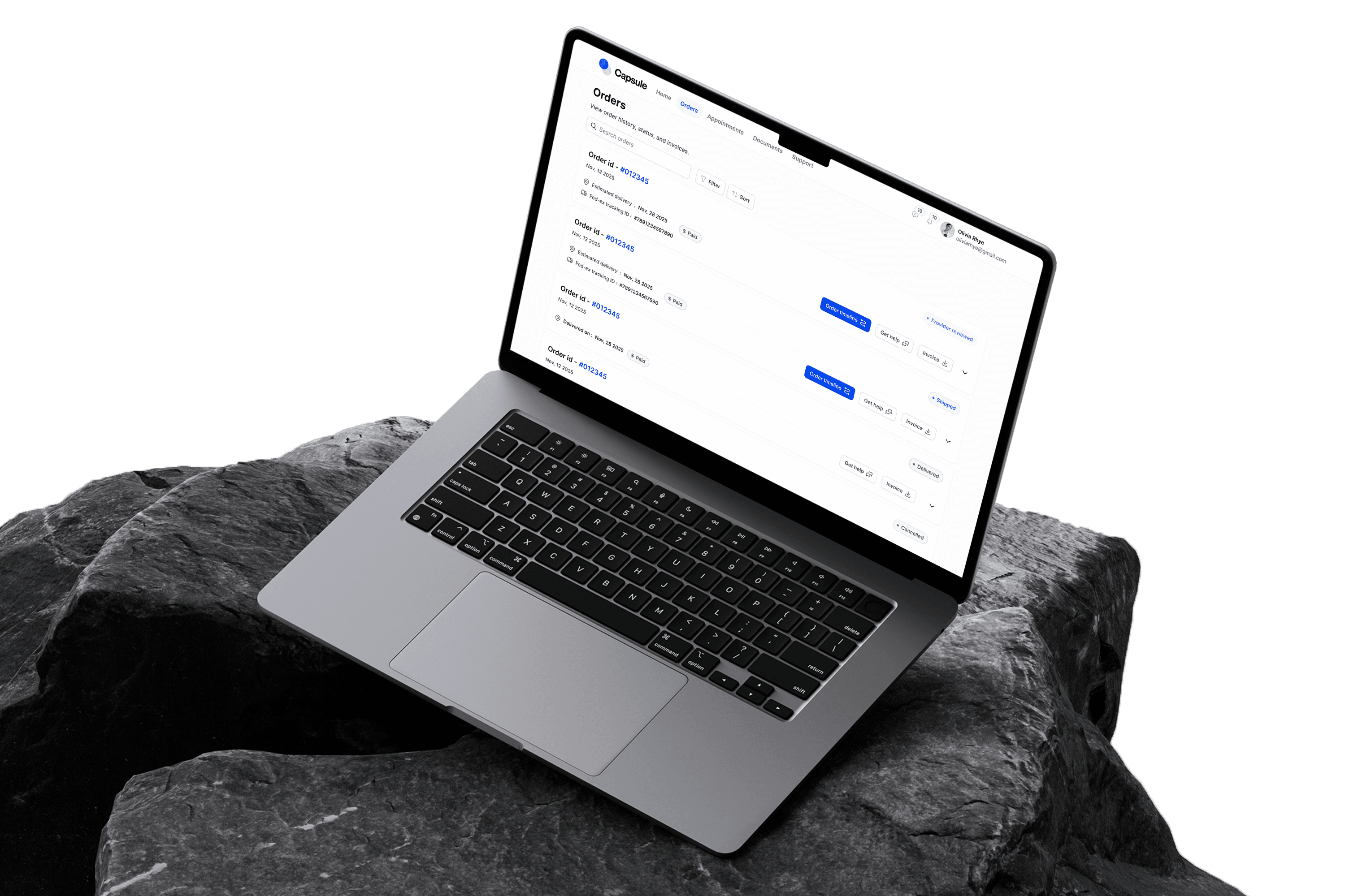
Track medicine orders and shipments with live status.
Documents
Prescriptions, results, and clinic-issued files.
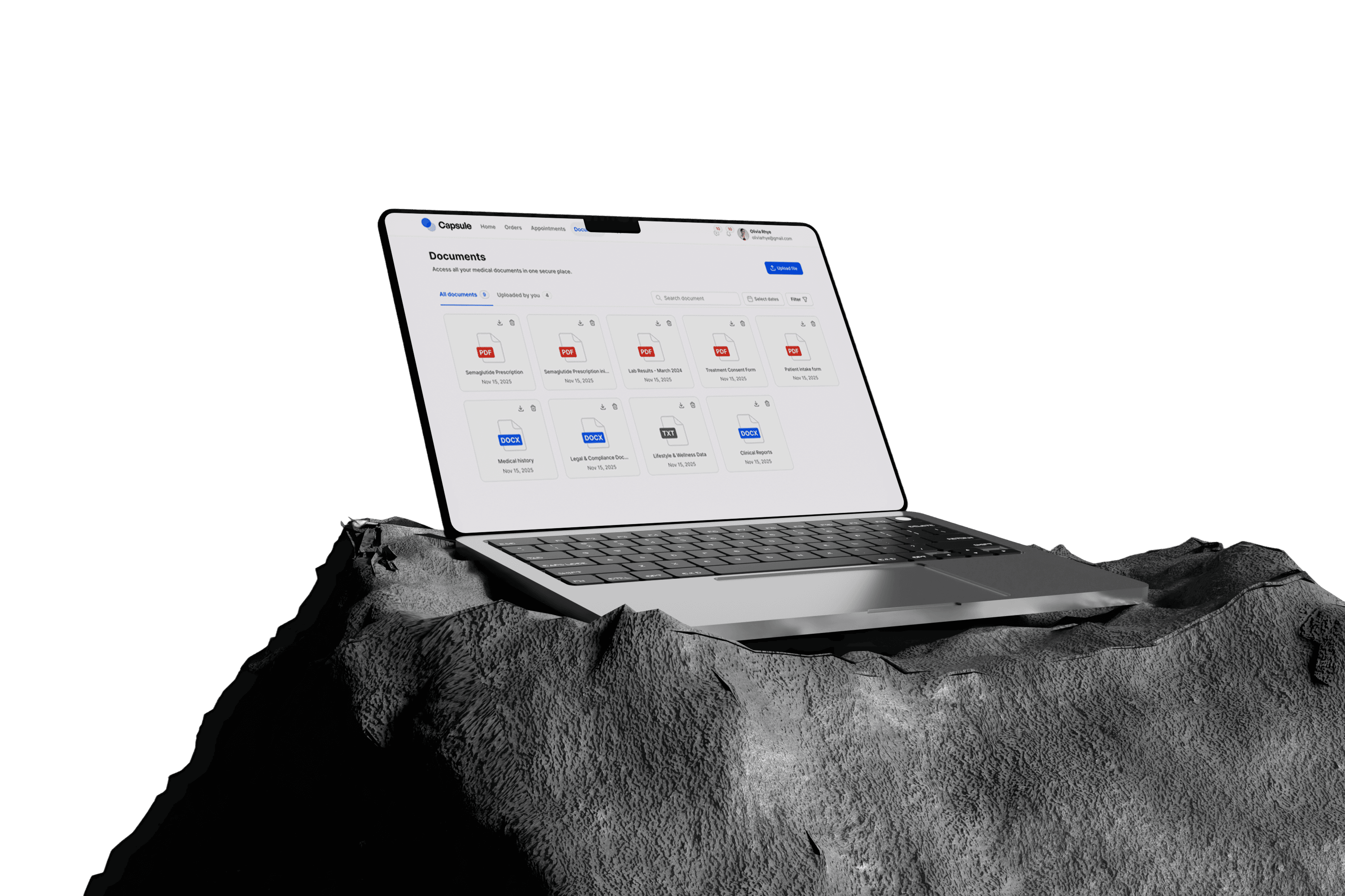
The home screen surfaces the three things patients check most: next appointment, active order status, and unread documents. It is not a navigation hub. It gives direct answers. This came from early client call discussions about where patients were calling support most often. Appointment confusion and order status were the top two reasons people rang the clinic.
All layouts were designed for mobile first. Every component — nav, cards, document list, order tracker — was built to work at 375px before being extended to desktop breakpoints. Healthcare portal usage skews heavily mobile, and treating desktop as the primary would have produced something that felt foreign to most patients on day one.
Previous clinic workflows had patients calling or emailing for support. The Wizlo portal embeds support messaging natively — no external links, no phone numbers. This keeps patients inside the product and gives clinic staff a logged, traceable record of patient communications. The design decision seems small; the operational impact for clinics is significant.

What shipped and what it produced
-34%
Drop in patient support calls
The client reported a significant reduction in patients calling for order status and appointment queries after the portal launched. These were the two top call drivers before Wizlo.
40%
Faster patient record retrieval
Clinic staff reported finding and opening patient records substantially faster with the new table interface compared to the manual system they had been using previously.
3 phases
Delivered without architectural rework
PM2 and PM3 extended the patient chart cleanly because of decisions made in PM1. No screens had to be rebuilt. They only needed to be extended.
0 to live
Faster patient record retrieval
The patient portal evolved into a responsive, 5-section product: Home, Appointments, Orders, Documents, and Support.
Wizlo went live. And it opened doors.
The product launched. Clinics started using it. And for us as a team that was the real validation — not a handoff or a sign-off meeting, but an actual live product that real clinic staff and patients were using every day.
What happened after that was something I did not expect when I started the project. Because the client was happy with what we built, Wizlo became a reference point. Other healthcare businesses in the same space saw the platform, liked what they saw, and came to us wanting the same quality of thinking applied to their own products. We ended up taking on new projects within the healthcare domain directly because of the work done here.
That is probably the best outcome a project can have. Not just a product that ships, but work that earns the next opportunity. It told me that getting the details right — the ID verification flow, the timeline architecture, the mobile-first decisions that nobody would consciously notice — those things add up. Clients and other businesses noticed even when they could not articulate exactly why the product felt trustworthy.
For me personally, Wizlo was the project that showed me what designing inside a complex domain actually requires. Healthcare is unforgiving. The users are not browsing for fun and the stakes of getting something wrong are real. Working in that environment for the first time changed how I approach any project now — I ask harder questions earlier, I care more about edge cases, and I take the handoff as seriously as the design itself.
